pandas.DataFrame.plot() 是 pandas 库中的一个绘图函数,它允许我们使用数据帧(DataFrame)中的数据绘制各种类型的图表。使用 plot 函数可以帮助我们更直观地了解数据的分布、趋势和关系。
使用方法:
pandas.DataFrame.plot(kind=None, x=None, y=None, figsize=None, title=None)
参数说明:
假设我们有以下数据:
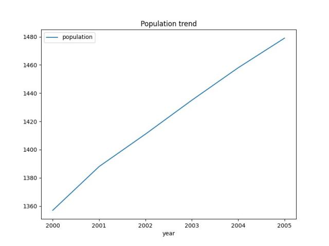
| year | population |
|---|---|
| 2000 | 1357 |
| 2001 | 1388 |
| 2002 | 1411 |
| 2003 | 1435 |
| 2004 | 1458 |
| 2005 | 1479 |
我们可以使用 plot 函数绘制该数据的折线图:
import pandas as pd

data = {
    'year': [2000, 2001, 2002, 2003, 2004, 2005],
    'population': [1357, 1388, 1411, 1435, 1458, 1479]
}

df = pd.DataFrame(data)

df.plot(kind='line', x='year', y='population', figsize=(8,6), title='Population trend')
执行以上代码,可以得到以下折线图:
示例 2:柱状图
我们有以下数据:
| name | math | english | science |
|---|---|---|---|
| Michael | 85 | 78 | 92 |
| Sarah | 74 | 89 | 82 |
| William | 82 | 75 | 78 |
| Elizabeth | 90 | 92 | 87 |
我们可以使用 plot 函数绘制柱状图:
import matplotlib.pyplot as plt
import pandas as pd

data = {
    'name': ['Michael', 'Sarah', 'William', 'Elizabeth'],
    'math': [85, 74, 82, 90],
    'english': [78, 89, 75, 92],
    'science': [92, 82, 78, 87]
}

df = pd.DataFrame(data)

df.plot(kind='bar', x='name', y=['math', 'english', 'science'], figsize=(8,6), title='Exam scores')
plt.show()
执行以上代码,可以得到以下柱状图:

本文链接:http://task.lmcjl.com/news/17715.html